
Guide
The Steps Total Doesn't Match the Hourly Chart? Here's Why
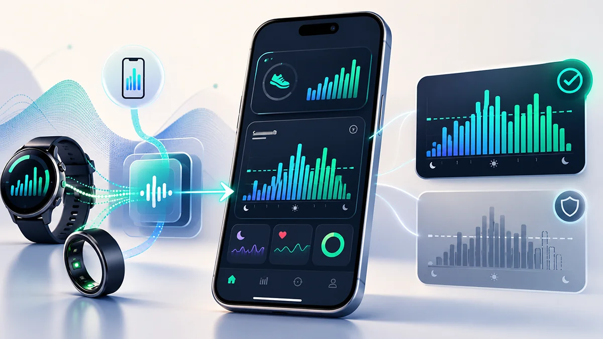
A daily total and an hour-by-hour chart that sometimes isn't there: it's not a bug, it's how FitMesh handles multiple sources of the same data without making up numbers.
TL;DR
- The day's total and the hourly chart answer different questions: how many steps in total, and in which hours.
- FitMesh doesn't add sources together and doesn't pick a winner by the biggest number: it picks the most consistent source with the most hours measured that day.
- Since version 3.10.0: when hourly detail is usable and comes from the same source as the total, FitMesh can show even a partial curve, stating its limits. If the provenance isn't verifiable, comes from elsewhere, or the numbers don't add up, FitMesh won't show that curve even though the hourly data exists: it doesn't promise full hourly coverage. On earlier versions, a mismatch like this hid the whole chart without this distinction.
- Steps without a specific hour are never spread across the chart to make the numbers line up.
- The dashed line is your own average from previous days, not a goal.
If you wear more than one device, you might see a steps total at the top of your day and, right below it, no hour-by-hour chart, or a chart that seems to tell a different story than the big number. These aren't two unrelated bugs: the day's total and the hourly chart answer two different questions, and sometimes only the first one has a reliable answer.
Why multiple sources aren't simply added together
If your watch, ring and phone all track steps on the same day, they're counting the same real steps: adding them up would inflate the number. FitMesh doesn't add sources together indiscriminately, and it doesn't settle things by simply picking the higher value either. Instead it picks the source that's most internally consistent and has the best hourly coverage for that specific day: a value that doesn't contradict itself and actually measured more hours wins over one that simply has a bigger number.
Why the hourly chart sometimes doesn't show up at all
The hour-by-hour chart and the day's total can come from different sources. Since version 3.10.0, FitMesh only draws the curve when the hourly detail is usable and demonstrably from the same source as the total: when that's the case, if it covers the whole day it shows it in full, and if it covers only part of the day it shows it labeled as partial, with the portion that has no hourly breakdown noted alongside it. But if the hourly detail's provenance isn't verifiable, comes from a source other than the total's, or the numbers don't add up, FitMesh won't draw that curve under the total — even when the hourly data exists: that would show the shape of a number that isn't its own. The day's total stays visible either way, but the hourly chart isn't guaranteed to always cover the full day. On versions before 3.10.0, this distinction didn't exist: a mismatch like this always hid the whole chart.
One important point: steps that don't have a specific hour attached are never spread across the hours just to make the numbers look right. That would be a nicer-looking chart built on a made-up number. FitMesh would rather show nothing than show something that was never actually measured.
What the dashed line actually means
The dashed line on the chart is not your steps goal: it's your own average from previous days. FitMesh calculates it over the calendar days right before the one you're looking at (up to 7), counting only days with a real value greater than zero: a missing or zeroed-out day isn't treated as a zero that drags the average down, it simply isn't counted at all. If you have fewer than 3 valid days in that window, no line is drawn: better no line than an average built on too little.
Practical checks in Health Connect and Samsung Health
- Open Health Connect (Settings > Apps > Health Connect > Connected apps) and check which apps write steps: if there's more than one, an occasional mismatch is expected, not a bug.
- On Samsung Health, check whether the step count comes from a single cumulative device (e.g. the watch tracking the whole day) or from several separate sources: a cumulative count covers more hours but isn't as granular as a real hourly series.
- Look at how many hours each source covers on a typical day: a source that only covers a few hours (e.g. only while the watch is on your wrist) will more often show no chart than one that covers the full day.
- If your phone stays at home for a few hours, the phone's step sensor stops measuring during that window: that's a source with partial coverage, not a malfunction.
Source limitation or bug: how to tell the difference
A missing chart on a day with multiple devices, a source that only measured a few hours, or a device left charging, are expected limits of data coverage, not a FitMesh error. It's worth writing to us if the chart is systematically missing even with a single device that covers the full day, or if the day's total itself changes inconsistently from one moment to the next with no coverage explanation.
Frequently asked questions
Why don't I see the hourly steps chart today?+
Since version 3.10.0, this happens when the available hourly detail can't be shown as a reliable picture of your day's total: because it comes from a source other than the total's, because its provenance isn't verifiable, or because the numbers don't add up. In every one of these cases, FitMesh won't draw that curve, even though the hourly data exists: it would rather not show it than present it as if it were your whole day. The total stays visible regardless, but the hourly chart isn't guaranteed to always be complete. On earlier versions, the same mismatch always hid the whole chart.
Is the dashed line my steps goal?+
No. It's your own average calculated over previous calendar days with a real value (up to 7, at least 3 for it to be drawn). It doesn't represent a goal you've set.
Can I force the hourly chart to show up?+
No, and you wouldn't really want to: forcing it would mean rescaling or making up data to match the total. If you want the chart to show up more often, what actually helps is increasing the hourly coverage of the source you keep on you most (for example wearing your watch or ring longer during the day).
Does this apply to other metrics too, not just steps?+
The principle of not adding sources together and preferring the more consistent one applies generally to cumulative data. The exact mechanism described here, matching the hourly sum against the total, is specific to steps.
Medical disclaimer
The information in this article is for informational purposes only and does not replace advice from your physician, pharmacist or healthcare professional. FitMesh Sync is a fitness/wellness app, not a medical device, and does not diagnose or treat any conditions. For symptoms, clinical questions or treatment decisions always consult your primary care physician.
Written by
Matteo Pizzi
Founder & Solo Dev, FitMesh Sync · Fosforonero
Italian software developer. I built FitMesh Sync to fill the gap between my smartwatch and a real personal dashboard. Privacy-first, indie.
More about the projectKeep reading
What's New
Now you know which device each metric comes from
Watch, ring and other devices in one screen, with a clear label of which one measured what. One view, no double counting.
Guide
What FitMesh Adds to Your Galaxy Watch Data
Samsung Health stays the control center for your Galaxy ecosystem. FitMesh adds value when your data also comes from a ring, another app, or another device.
What's New
Multi device dashboard: all your wearables in one view, no duplicates
With today's update, FitMesh Sync introduces the global dashboard: a single screen that aggregates data from watches, ring and other sources, eliminating duplicates and always showing the best value for each metric.